


Waterfall, 18" x 12"
This experiment is meant to help you identify the value of a color and use multiple colors in any given value area.
First find a photograph that contains good contrast and a range of values that you would like to use for a painting. Make two black and white copies of it, enlarging them to about 8"x10”. If you’re able, blur one of the grayscale photos. If not, it won’t make any difference. Just be sure you have one clear grayscale print, and a second one that is either blurred or not. Blurring it sometimes simplifies the choice of value areas.


As you cut out the pieces reassemble them over the grayscale copy so that you can see where they belong. Lightly number each piece with a line pointing to that area in the grayscale photo, and then number the back of the cutout pieces to match. All this is meant to do is to help you reassemble the parts into a whole again.

Take each value (or grouping of values) and prepare a clean, preferably white piece of drawing paper that will become the chart of colors you might use. Number them from one to five or six, depending on how many values you use.
Lay the hole in a value finder over the value shape cutout to find its value number from 2 to 9. Note the number of that value on your clean paper. * Note: There is no standard for numbering grayscales. Some will number white as 1 and some will number black as 1. Use whatever your value finder says and disregard others.

Have fun! Any color is okay. Try colors that often go unused. Think value, choose color. This is no longer a sky -- it‘s a light value. It’s not trees, but a chunk of dark colors. That’s no longer the ground but a harmony of medium colors. If you need to, turn the value shape cutout another direction so that it loses its identity as an object, such as trees, and can only be identified as a value.

You’ll know the values are exactly or almost exactly the same if, while squinting, they seem to blend into one larger shape. Look at the illustration above and notice how when you squint the blue centered in the hole and the gray surrounding it seem to merge into one. (If you can't see it, squint more.) Then mark the colors with the edges touching and you will quickly see if they are the same or very nearly the same value. As you can see in the mass of colors touching here, when you squint they become one larger shape, indicating their similarity in value.
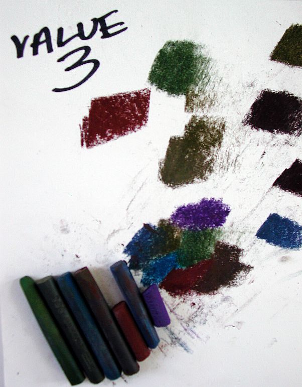
It might be a good idea to lay aside the colors you have chosen from your palette so that you can easily find them again. You will be returning to these exact colors for your finished painting. It's helpful to make a chart for each value listing the value number and the colors, and lay out the pastel sticks on it. Do this for each of the value groupings in your painting. You should have three to six value charts. showing the color possibilities you might use in a painting of this image.

Now, looking at the original, whole grayscale photo, compare it with the charts you’ve made. Notice that you’ve selected many different colors of the correct value for each value grouping. Using only the grayscale photograph and your imagination (no pastel for now), envision a version of the image using different and varied colors. Imagine some different color possibilities for your painting. Take your time and think. This is valuable time and necessary to do.
Then using the grayscale photograph make three different sketches, loosely trying out different color layers to see just how the values work. Layer colors over one another or use broken color, putting them side by side in your painting. You don’t need to use every color in every painting, but remember that as you layer colors they will appear to be different depending on the last color applied. Perhaps it would help you to work in a format similar in size to the black and white copy. Paint quickly so that your brain doesn’t have time to demand “real” colors. Be playful, have fun, don’t let the finished product blackmail you into becoming colorless or vague. This is a color experiment! Find what is expressive and beautiful.
When you have completed your color sketches, select one to use as a basis for a larger, more finished painting using beautiful and expressive color.
(I apologize for not having any painting samples to show you from the above color choices, however here are some colorful paintings done using this method.)

Final Touches, 12" x 9"

Shadow Colors, 9" x 12"

Green at Pink Time, 9" x 17"
No comments:
Post a Comment