Entri Populer

Labels

Friday, April 30, 2010

Bright Lights, Big City

As long as I can remember, I have felt a pull between two opposites- a love for the countryside and a love for the city. While I am completely at peace in the country, there is something about big cities that makes my pulse race in the most exhilarating way.


Helena Palazzi Photography

The traffic. The noise. The people. The lights. The buildings. All of these things and more capture a piece of my heart.


Martin Rusch

I love staring out a window many stories in the air, taking in building upon building with skyscrapers lined up as far as the eye can see.


Helena Palazzi Photography

Especially at night. When light and darkness meet halfway.


Troy House Photography

For the next few days I will be in and around New York City, and my heart is filled with happiness. I have a weekend filled with not only the excitement of the city, but also the company of family and friends, ones who it has been too long since I've last seen.

Midweek, I move on to Massachusetts to spend time with some more close friends who I also haven't seen in far too many years, and I most likely will be MIA for a little over the next week; I hope during that time you have many moments of sweet bliss, as I intend to enjoy many of the same.

Wednesday, April 28, 2010

Going to the Dogs

I've mentioned before how head over heels E and I are for our two dogs, so it might not be surprising we both desired to have them be part of our wedding celebration. While we weren't able to make it happen, I still love seeing when couples do include a furry, four-legged family member in their big day!


CHAPTER TWELVE – FOLIAGE

(With thanks to The Pastel Journal where this was originally published.)

At Rest, 12" x 9"
The drape of leaves, like the folds of fabric covering a model, is dependent on the form beneath. Unlike the hard skeleton, foliage is gentle and flowing, wrapped over and around the structure of a tree. We’ve analyzed the trunk and branches of the tree and now we need to spend time looking at the leaves clothing the tree in softness and color.

Foliage can be seductive, often tempting the artist to over-detail each leaf in an effort to describe the complexity found there. Painting foliage should be like writing poetry, a simple, spare means of describing the details of the mass of leaves, one that evokes the soft resonance of the wind stirring the tree to life. The Japanese poetry called haiku might be the best model to use, a simple and stylized impression that’s brief but powerful, rather than a novel that laboriously describes each detail.

Instead of painting every leaf, find a stroke you can use to suggest the overall effect of the leaves. This might be a quick squiggle that hops and jumps over the paper, a slanting, repetitive stroke, or a random scribble that, when repeated, becomes a pleasing mass. Painting every single, meticulous, little leaf can be a dull activity for artist and viewer alike.

Use texture and color to indicate fine points in the mass of the tree. Instead of detailing the entire canopy, find particular places where you can use a detailed stroke to indicate the shape and pattern of the leaves. Think of the general shape of the leaves, long and thin ones on a willow, round and compact ones on a cottonwood, and develop a stroke that mimics the leaf shape well but does not require each leaf to be painted. Use this detailed stroke at the edge of the foliage against the clear sky, where a dark mass of foliage meets a lighter one, or where there’s a dramatic color change. These are the areas of interest that indicate the amount and type of leaves.

SKETCHING

Begin by sketching in the tree as one whole shape, a simplified geometric outline of a triangle, circle or oval. A pine might be a triangle, while an oak is an oval or circle. Find the outside edges of the entire tree, even if it’s off the top or sides of the paper, and make light marks that encompass it from top to bottom and side to side. This will help you keep from making the tree duck down, as if the top of the paper is a low ceiling, as well as helping you find the correct scale of it in relation to other objects in the painting.

Now sketch in the outline of the overall balloon of the foliage, as separate from the trunk. This time avoid a perfectly geometric shape. Instead find the rhythm of the tree, where it leans or bends, where gaps occur. Look for the gesture of the tree, as it leans in the wind or reaches tall and straight to the sky

The close-up at right shows the many colors used beneath the green foliage, as well as the detailed edge strokes of dark and light suggesting leaves.

Now locate the various branches and the large clusters of leaves they support, as defined by the light and shadow on them. If there’s a major branch, it will bear a major cluster of leaves. Likewise, if there’s a balloon of foliage it must have a branch from which it sprouts. Don’t leave one without the other. Remember that the smallest branches, numerous tiny twigs that each has a small bouquet of leaves, mass together to hold the foliage. Most of the time you won’t see these little branches amid the mass, except where they occasionally project, adding a variety of texture. Often a cluster of foliage will fall in front of large branches and obscure them, but it’s best to know where these branches occur, whether or not you see them clearly when finished. Usually there’s some evidence of them peeking between the leaves, as well as above or below the mass. Smaller branches weaving through the leaves can move the eye, enhancing the sense of three dimensions.

PAINTING FOLIAGE

Although there are many ways to approach painting foliage, one way is to lightly paint in a layer of color all over using a medium value, and then divide that up into the smaller foliage balloons. An open stroke, using the flat side of the pastel stick, is particularly good for this part of the painting. After establishing the overall tone of the tree, whether it’s green, yellow, or any other color, use a warmer, slightly lighter color for the areas in light and a cooler, darker color for those in shade. This light and shadow should show which foliage balloon rests in front and which is behind.

Negative shapes are an important consideration in painting a tree. Sky holes can be particularly beautiful, allowing a peek at the clouds, sky or land behind the tree, adding contrast and sparkle to the mass of foliage. Look for the syncopated rhythms of these holes, where clusters of leaves divide and light shines through. Design the movement of the eye through the trees using these breaks.

Green is a color that seems to perplex some artists. You may find you have a vast collection of green pastels that you’ve gathered in an effort to find the ‘right’ green. If you need to solve the green dilemma, try using warm colors beneath and amid the green. Dash in some orange or add a stippling of purple, red or ochre. The use of complements and near-complements jazzes up the color, exciting the visual receptors in the eye and relieving the sameness of green.


FOCAL AREA AND BACKGROUND TREES

Consider how warm, light colors appear to advance and cool, dark colors seem to recede. Use this principle to give the tree depth. As you paint your tree, establish a focal area, often using warm, light colors. Contrast that with an area in shadow behind it where you can layer cool colors, creating a visual tension that further enhances the focus. Be sure to include other foliage that overlaps, dark over light and light over dark, though to some slightly lesser degree.

Also consider the fact that inside the dense foliage of a tree there’s very little light. Look for dark shadows cast in the center of a tree and the light outside on the foliage. Different varieties of trees show this to varying degrees, some more open and light while others are dense and dark. Analyze the tree you’re painting with this in mind.

Remember that intense colors attract the viewer’s eye, pulling them visually to this area. Often this, coupled with an area of high contrast, will be the place where the eye goes first. You must then move the eye through the tree, often in a vaguely circular or oval pattern, enhanced by a detailed edge. Conversely, you can create a sense of distance by diminishing contrast, detail, edges and intensity. In a very large grove of trees, the farthest ones will be quieter, less intense and detailed, while the nearer trees will have a clarity and brightness that plainly establishes them as standing in front.

Patterns are useful in suggesting trees at a distance. Repeat the characteristic overall shape of the trees, whether tall and thin, triangular or rounded, and use muted light and shadow to indicate a tree-covered hillside or distant grove. Overlap near shapes over far ones and use accurate scale to improve the sense of depth. Remember, however, that patterns can also work against you, becoming lifeless and boring. Avoid unconscious patterns that make your painting dull, with no sparkle of life. The distant hillside has a supporting role but should not become flat and tiresome in its sameness. Work to achieve an interesting quietness that enhances the focal area of your painting in a strong way, but isn’t jumbled and distracting.

When you’re painting a grove of trees, be sure to vary the values, as well as the sizes and shapes of the trees, while allowing for repetition in trees of the same species. Don’t let every tree lean in the same direction unless it’s a characteristic of strong wind, such as the famous trees at Torrey Pines in California. Even then, don’t repeat the same forms over and over. Vary the shape as well as the texture of trees standing in a group, to some degree.

The old growth forests have developed a canopy of foliage that virtually blocks out sunlight beneath the trees, leaving a floor of mossy mulch and ferns that grow well in shade. When painting this kind of forest look for the deep shade of the floor and the brilliant contrast of sunlight in foliage above.

FLOWERING TREES

Flowering trees take on a soft, floating quality, newly dressed in a lacy veil of petals and soft, young leaves. The value of the tree is generally lightened when it flowers, often pastel pink or dazzling variations on white. This gives an opportunity to stretch your range of colors as you layer a great variety of them together to form the clouds of flowers on various branches. Look for a softer stroke that can indicate the petals, usually one that’s lazier and not as vigorous as that used for leaves alone.

Don’t forget that flowers adopt the habit, as do leaves, of growing in a spiraling pattern around each branch. You’ll notice that there’s a bit more contrast in a flowering tree, usually due to the darkened color of the branches in springtime growth, which are more apparent throughout the tree. Because flowers aren’t as dense as leaves, there isn’t as much shade in the interior of the flowering tree. Paint these springtime blossoms with a light, quick stroke to achieve the fluttering quality of the breeze moving them. Scatter petals across the ground, as well, where the wind deposits them.
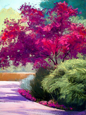
Springtime Reds, 18" x 12”

FALL TREES

In the fall trees turn an amazing variety of colors, from blazing orange, red and yellow-gold to russet, ochre, and greenish-yellow, all the way to deep purplish-red. This is the time when you can devote your paintings to color, but be careful not to heighten the color of all the trees and miss the subtleties that let the colors resonate. Contrast bright colors with quiet colors, allowing the light to pick out one tree or a small grove standing against more muted, distant ones.
Fall Tree, 12" x 9"
All of the general rules for trees apply in the autumn, with a slight shift toward a lighter value in some cases, such as aspens. Trees that were medium in hue when they were clothed in green might change to a medium-light value when wearing yellow leaves, although at various times there can be blend of green and yellow that necessitates only a slight value shift.

It may be a good idea to use a colored filter to compare the values of the tree standing in nature, the photograph if you’re using one, and your painting. Use a blue filter if your trees are red, since a red filter will make red appear white, or a red one if the trees are green or yellow. The filter allows you to analyze the values in context with the rest of the painting so that you can clearly see how light or dark different parts of the tree are.

Your autumn painting might include trees that are beginning to lose their leaves, opening up the foliage and allowing more gaps where the braches and sky shows through. This can make for an exciting effect as the contrast in value and intensity between the fall leaves and the sky is quite beautiful. Remember to include fallen leaves on the ground, which are usually more muted in color and value because they have lost their vibrancy.

PINE TREES

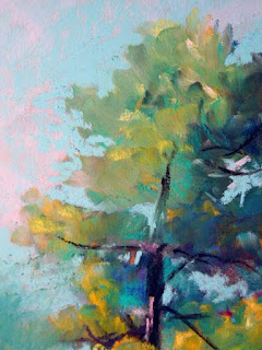
Santa Fe Pine, 12" x 9”
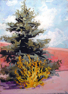
Pine trees come in many varieties, from blue spruce to piñon to towering ponderosa pines, but all share some common traits. The general value of pine trees is medium-dark to dark, depending on the light source and the time of day. Shade the green of pines with a drift of orange in the sunlight and a hint of purple in the shadows, to excite the green. Pines usually grow well only at certain altitudes, so you find one type predominating in most areas, though there can be a mix of one or two varieties, as well. Pines generally don’t have an open growth pattern but are dense and closed, except at the very outside edges. A few pines tend to grow in a slightly more open pattern, especially long-needled ones. The classic ‘Christmas tree’ shape, a wide-based triangle, is characteristic of only a few pines. Most tend to have a much more cylindrical shape and taper only slightly at the crown of the tree. Analyze the overall shape before painting a pine tree and throw out any preconceived ideas you have.

Mastering the art of painting trees is necessary for the landscape painter and requires time spent observing them and time at the easel painting. One of the advantages of painting trees is that at different times of the day and in different seasons the same tree can take on such different characteristics, giving you a great diversity of subject matter in one place. When you’ve found a tree you admire, spend time studying it. Do you particularly enjoy the shape of the tree, the gesture of the trunk, the pattern of the branches, the shadows it casts in a certain light? Does the fall color excite you? Or is it the lacy dress of flowers on it in the springtime? Whatever it is about the tree that attracts you, return to it to practice seeing and recording its beauty.

Find your own voice, the poetry that describes the boldness or delicacy of the tree, spoken as only you can say it, and use it to describe the diversity and beauty in your rendering of trees.


Los Poblanos Autumn, 12" x 9"


San Carlos, 12" x 12"


Amazing Art of Calf Japanese Tattoo Ideas With Koi Fish Tattoo Designs With Image Calf Japanese Koi Fish Tattoo Gallery

Amazing Art of Calf Japanese Tattoo Ideas With Koi Fish Tattoo Designs With Image Calf Japanese Koi Fish Tattoo Gallery 1Amazing Art of Calf Japanese Tattoo Ideas With Koi Fish Tattoo Designs With Image Calf Japanese Koi Fish Tattoo Gallery 1


Amazing Art of Calf Japanese Tattoo Ideas With Koi Fish Tattoo Designs With Image Calf Japanese Koi Fish Tattoo Gallery 2Amazing Art of Calf Japanese Tattoo Ideas With Koi Fish Tattoo Designs With Image Calf Japanese Koi Fish Tattoo Gallery 2


Amazing Art of Calf Japanese Tattoo Ideas With Koi Fish Tattoo Designs With Image Calf Japanese Koi Fish Tattoo Gallery 3Amazing Art of Calf Japanese Tattoo Ideas With Koi Fish Tattoo Designs With Image Calf Japanese Koi Fish Tattoo Gallery 3


Amazing Art of Calf Japanese Tattoo Ideas With Koi Fish Tattoo Designs With Image Calf Japanese Koi Fish Tattoo Gallery 4Amazing Art of Calf Japanese Tattoo Ideas With Koi Fish Tattoo Designs With Image Calf Japanese Koi Fish Tattoo Gallery 4


Amazing Art of Calf Japanese Tattoo Ideas With Koi Fish Tattoo Designs With Image Calf Japanese Koi Fish Tattoo Gallery 5Amazing Art of Calf Japanese Tattoo Ideas With Koi Fish Tattoo Designs With Image Calf Japanese Koi Fish Tattoo Gallery 5


Amazing Art of Calf Japanese Tattoo Ideas With Koi Fish Tattoo Designs With Image Calf Japanese Koi Fish Tattoo Gallery 6Amazing Art of Calf Japanese Tattoo Ideas With Koi Fish Tattoo Designs With Image Calf Japanese Koi Fish Tattoo Gallery 6


Amazing Art of Calf Japanese Tattoo Ideas With Koi Fish Tattoo Designs With Image Calf Japanese Koi Fish Tattoo Gallery 7Amazing Art of Calf Japanese Tattoo Ideas With Koi Fish Tattoo Designs With Image Calf Japanese Koi Fish Tattoo Gallery 7

Sunday, April 25, 2010

landrut tattoo and weed tattoos for girls lower back

tattoos for girls lower backtattoos for girls lower back

tattoos for girls lower backtattoos for girls lower back

tattoo on the upper back bodyck body

tattoo on the upper back bodytattoo on the upper back body

airbush tattooed with dragons in tattoo on upper back body, special designed for women with this design which will make your body look more interesting, hmmmmm ...... with this design will make you captivated men

best tattoo art designs with sexy model

tattoo art designstattoo art designs

Saturday, April 24, 2010

Joyful, Joyful

When I was little, I loved the summer nights when my family would head out to hear the local symphony play at an outdoor theater. We would arrive with a blanket and a picnic basket and settle in to listening to the orchestra play while eating our dinner outside in beautiful weather.


Tec Petaja via Once Wed


Simply Bloom Photography via Green Weddings Shoes via C Star Events


Roland Bello Photography


Lorenzo Agius


Thayer Allyson Gowdy

I still think camping out on a blanket while listening to good music, savoring delicious food, and relishing the company of family and friends is a fantastic way to spend a night, and as the weather is not yet too hot, humid, and muggy here in Houston, I am looking forward to enjoying just such an evening tonight. Whatever your plans, I hope your weekend is full of things you take joy in too!

Friday, April 23, 2010

Modern Japanese Tattoos

Modern Japanese TattoosModern Japanese Tattoos

Modern Japanese TattoosModern Japanese Tattoos

Modern Japanese TattoosModern Japanese Tattoos

Wednesday, April 21, 2010

CHAPTER ELEVEN -- TREES

(Thanks to The Pastel Journal, where this chapter was originally published, with additional information included here.)

Springtime Shade, 11" x 17"

Think back to when you were in first grade. Do you remember the landscape you made up, the one with the tree standing next to the house with the sun and cloud behind it? Your tree may have been a lollipop shape with a wavy edge or it could have had apples on it. Maybe it was the traditional Christmas tree shape, a large serrated triangle with a little square protruding from the bottom. That tree you remember is the shortcut you settled on a long time ago, the symbol for tree that you’ve had stored in your brain ever since. Maybe you’ve caught yourself using that symbol, or a version of it, when you paint a tree. It might pop out when you haven’t planned well and decided to add a tree to a painting. Your first grade tree, or an adult adaptation of it, that’s slightly more sophisticated but still fairly simple and symbolic, looks childish and oversimplified. This becomes a problem when you find yourself relying solely on the symbol. When you haven’t spent time studying trees, looking closely at the trunk and branches, foliage and bark, blossoms and fruit, you may too easily slip back to that elementary representation of a tree.

Trees come in an immense variety of shapes, sizes, colors and patterns. It’s difficult to know how to paint every kind of tree but as an artist you should develop a working knowledge of the general characteristics of trees so that you’re able to paint any you observe. You should study trees that are common to your area so that as you paint the landscape you can easily portray them, whether they’re to be the stars of the show or only appear in a supporting role.
The Light, 23" x 17"
First you must understand the anatomy of a tree in order to paint it properly. Just as a portrait painter must have knowledge of the bone structure underlying the face, you must understand the skeletal underpinnings of the tree. Think of the trunk and branches as the skeleton, the bones that frame the tree, on which the decorative clothing of the foliage is hung. Study deciduous trees in winter when the cold has removed the distracting cover of leaves, much the way the artist must paint the unclothed figure in order to come to understand the anatomy beneath the clothing. This way you can clearly see how the trunks relate to one another and how the branches spiral out in a loosely radial pattern along each trunk.

If you were able to look down on a tree from the top you’d notice this pattern repeated over and over, in the habit of trunks, branches, leaves, and blossoms. In order to picture this design, think of the barber pole where the spiral rises continuously. A tree rarely puts out branches at even and opposite intervals along the barber pole. One of the reasons an artificial Christmas tree looks fake is the intervals are too exact, with a branch sprouting out at perfectly opposing and predictable distances, unlike the real thing. On a real tree, the larger branches develop smaller branches in a roughly radial spiral pattern, as the tree grows taller. Leaves, buds and blossoms grow correspondingly. This corkscrew arrangement generally holds true for all trees from oak to pine, weeping willow to palm, with some obvious variations on the theme.

You can use this knowledge to your advantage in painting any tree. It’s one of the methods used to portray a three-dimensional tree instead of the flat, cutout shape of your first grade tree. Find branches that come toward you and go away, as well as those that grow side-to-side. Look for the balance, as branches shoot off one way and then, slightly higher up, in the other direction. Your first grade tree was probably fairly symmetrical and straight, drawn in a childish scrawl yet balanced and proportional. Now look for the way the tree leans and balances itself, how it puts out a root to hold itself upright or shoots a branch one way and then the other to maintain its equilibrium. This is often like a ballet, hard work that looks delicate and easy.

Remember that trees must be balanced to remain upright, although their tenacity is amazing. Once the root system is well established a tree can remain upright even when part of it is severely damaged. A lightning strike can destroy as much as half the tree and yet it can live on in its injured state because each trunk achieves a certain balance on its own. In the arid southwest near my home you can sometimes see a tree that’s growing along an arroyo, the bank of which has eroded away and left the tree growing horizontally out of the wall. The tree has righted itself and grows up toward the light with a 45 degree bend in the trunk. All of the other branches have arranged themselves to balance the tree in its upright growth.

Trees are competitive, though in slow motion, of course. Like any green plant, they need light to grow and survive. A mature stand of trees has fought the battle and each has established its little domain of available sunlight. Small trees may spring up in the shade of a larger one but won’t survive long for lack of sunlight. All of the branches on a tree need a certain amount of sunlight to thrive and the radial arrangement of branches, as well as the tapering habit of most trees, allows sunlight to reach all of the leaves. Branches inside a shade tree that don’t receive adequate light will die and eventually fall, so be sure to study the layout of branch and leaf patterns.

Blanco Grove, 11" x 23"
A mature grove of trees tends to interlace the finest branches at the outside edge of the foliage only, almost as if they’re at arm’s length. Younger stands may yet be battling for the light and can be more intertwined and closely related to one another, depending on the variety of tree. Sometimes these groves develop at the same rate, especially when there has been a fire and the seedlings have germinated simultaneously afterwards, in which case the trees may remain intertwined for life. When one is taken away, the remaining trees show evidence of the interrelationship that’s now gone, as they’re left bent and oddly balanced. Slowly the gap will become filled with foliage from neighboring trees that straighten up or lean into the breach, always maintaining their balance.

TREE STUDIES

In order to become adept at painting trees, choose one tree to study closely. Spend time looking at the whole tree, its growth pattern and habits. To become acquainted with the tree you might resolve to draw part of it every day for some length of time, perhaps a particular branch, then the trunk and bark, then the blossoms or leaves. Observe your tree at different times of the day and in different seasons, recording the changes. This intimacy with one tree can enhance your perception of all trees as you begin to learn the habits and patterns of trees in general and is a sure cure for the artist who suffers from ‘elementary tree syndrome.’

Tree Study, 9" x 12"


Consider the roots. Although they’re hidden, remember that beneath the ground this structure of roots is vital to hold the tree in place through all but the fiercest of storms. Roots normally grow outward to about three times the spread of the branches and anchor the tree in the soil as they penetrate the earth in search of water and mineral nutrients. In some varieties you can see the larger twisted roots at the base of the tree as they travel along the surface for a distance before delving deep. As you paint your tree remember what is underground supporting the tree, in order to avoid making your tree look like a bottle sitting on a shelf or a lollipop stuck in the ground in a pretend world.

Now explore the trunk of the tree. Try to capture the gesture of the trunk as it emerges from the ground, preferably as it leans into the picture plane. Does it twist or bow? Is it round or oval? Does it bulge or rise quickly, perpendicular to the ground? There may be two or three major trunks in an established tree, each growing in a slightly different direction, related but separate from one another. Avoid making the trunks perfectly straight or parallel to one another. Don’t fall back on that lollipop stick, straight and tall. Instead, vary the directions of the trunks to divide the space in an interesting fashion. Notice that the angle created by the spaces between trunks is wider than the angles of the branches above. The trunk is holding a tremendous amount of weight, which causes the larger gap, so look for its strength and suppleness.

Take a close look at the bark of your tree. Is it craggy and gnarled, flat and smooth, crumbled and peeling, or some variation of these? Bark is a characteristic that identifies different species as surely as do the leaves. The bark is the tree's protection from the outside world, its skin. Young trees, and the younger branches on any tree, have smoother bark, so look for the smooth suppleness of the outer branches. The loosely organized ridges and fractures of bark, running in roughly vertical stripes up and down the length of the trunk and branches, can indicate to your viewer the direction the limbs move in space. To illustrate this idea, pull your sleeve down over your hand and grasp it firmly. Now twist and bend your arm and notice how the ‘bark’ shows the movement. Paint with this in mind.
Winter Juniper, 17" x 11"
As a child you colored the bark brown or gray but now you should look for the many color variations you can use to create a more interesting effect. Instead of using gray, layer complementary colors on top of one another or arrange them side by side to create a visual blending that suggests a lively gray. Instead of using brown, do the same with tertiary colors, putting together orange-green-purple, red-blue-yellow, or some interesting variation on this idea.

Shadows help show the shape of the trunk and branches and what directions they move in space. Where they cross the bark they can create a fascinating interplay of colors. The bark will be slightly darker and cooler in color in the shaded area, creating an interesting relationship to colors in the light. Technically you may approach shadows by feathering a light layer of soft charcoal or dark blue pastel pencil over the bark colors you’ve laid down, which darkens and blends the pastel slightly. Or you might reserve the shadow areas for entirely different colors, darker and slightly bluer, to contrast with the bark colors. There may be places where darkness creeps along the edge of a crevice in the bark as the light catches the rough edge of it. Touches such as these can make bark one of the most interesting parts of the painting.

Remember that branches grow thicker at the base and slimmer at the tips. Avoid ‘thigh’ shapes, thin, thick, thin, which can distract your viewer unless you’re focusing on painting a misshapen burl. One of the pleasing characteristics of trees can be the lithe growth, their lightness and airiness, almost as if they’re standing on tiptoe.

Evening Stand, 9" x 12"
Strive to make a three-dimensional tree, one that has depth as well as width and height. Some branches come toward you, while others lean away. If a branch is headed directly at the viewer it will be severely foreshortened or appear to be a mere spot, and can be somewhat difficult to see unless branches protrude from the sides in varying directions. A branch that’s moving backwards will be in perspective and the converging lines of bark can help achieve this illusion, as well as the lightening effect of distance. You can also indicate the depth of the tree by carefully rendering the light and shade on each branch, which will help to show its direction. Try not to make any branch perfectly cylindrical or it will look like a stovepipe. Branches have gesture and flow to them, much like arms or legs. Avoid ruler-straight lines that make your tree look stilted and unreal, back to the lollipop shape again. At the top the tree supports a multitude of small branches that hold the leaves, forming the canopy. Paint your tree with progressively smaller branches and avoid a heavy branch at the top or outside.

Trees are radially symmetrical, meaning both halves are roughly the same. You could place a mirror at the center of the tree and see a matching image. However, try to paint your tree so that it isn’t simply made up of two identical halves but has asymmetrical qualities that make it more interesting. Broken branches or ones that have been cut off can change the balance of the tree, often making it look oddly lopsided. Be sure not to return to the boring symmetry of your first grade tree once again.

When a branch is cut off at the trunk it leaves a rounded oval scar that heals over time, though it won’t re-grow bark. Instead, the knot develops a ridged callus that protects the tree from insect invasion or decay. Look for the pale oval of healed cuts on the trunk for color variation, shadows and texture.

Unlike the lollipop tree, now your tree should be a sophisticated study of the trunk and branch patterns that shows the asymmetrical balance and the agile movement of the branches, using bark details and shadows to show movement. This tree is alive and growing, moving in the breeze, as it holds its weight of branches and leaves easily.

(Next week: Foliage.)