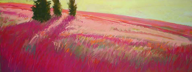
Hillside Progression 2, 11" x 23"
Color is the lifeblood of a painting. It’s the energy and animation, the element that inspires the heart and touches the core of the viewer. It’s extremely personal and yet has universal overtones. It has been codified and studied, yet always seems to escape definitions that restrict its use. Out of the frustration of creating muddy color in pastels, as well as successful attempts to use compelling color, arises the greatest growth. In the hands of the master pastelist color can have more depth and excitement than any other medium.
The rules of color use must be respected and understood so that they may be skillfully utilized or more skillfully broken. As youngsters we came to know that yellow and blue make green, whether we learned it from a gentle teacher or from a television jingle. Yet teaching children further basics of color use are often neglected, left to the realm of play alone. The art student often comes to color in her studies last, after studying composition, drawing and value, which are somewhat more easily taught. Color seems more mysterious, a bit perplexing and hard to explain.
There comes a time in each artist’s career when she must question green and define it as both yellow and blue -- and perhaps think of green in terms of red (its complement) or orange and violet (its split complements.) That’s when color becomes personal, intuitive and truly useful to the artist. It’s also the time when questions come, doubts rage and real learning begins.
Glow, 12" x 18"
The student approaches the master to ask how to make color succeed, how to use it to freshen the expression of a painting, to escape the dreaded dulls of personal habit. “I want to loosen up the way I use color,” she declares. She’s read the books and considered theories in the abstract. She knows the color wheel and has become apprenticed to the master in her head. Yet nothing replaces the pastel-beneath-the-fingernails work. The master says, “You want to learn about color? Use it! Paint, paint, paint!” These questions cannot be answered by theories or rules, only by experience.
So what questions are best? What might the student do to learn from her work? Each journey is individual, with its own moments of growth and personal dissatisfactions. Questions often beget more questions, yet good questions finally result in some answers. We must share the answers, which no doubt will show in the master’s final body of work. Even more valuable might be sharing the questions, which is the ultimate role of the teacher.
California Skyline, 12" x 18"
General color theory holds that cool colors recede while warm colors advance, complements laid down side by side excite the eye, dark colors have more weight than light colors and intense colors should be used to accent not inundate. There’s no denying that color is relational, that it works in association with surrounding colors. These have becomes rules because they commonly hold true. But may they be abused and broken, and thereby made to work for different reasons, to other ends? Why might I not flood the paper with the most brilliant color imaginable to achieve a somber mood? Is it possible? How can I know if I only accept traditional wisdom?Color and value are inextricably linked. Years of traditional thought hold that one should structure a painting from a drawing and value standpoint before adding color. Begin with a great rendering, sort out the values and stay true to those decisions, laying down accurately matched colors over your chosen values, and you will have a successful color painting when done. Argue with this and you can spend hours at any pastel convention deep in philosophy over lunch. Argue it on paper instead and see where you end up.
Try structuring the painting solely on color first -- no drawing at all, nothing on that paper but the gaping, empty surface. Begin with the most neglected and unused pastel of any color in your palette. Do you neglect magenta? Put down a definitive swath of it across the paper. How about that brilliant yellow-green, the one you’ve only used one time to touch the tips of sunlit leaves in the final dabs on the summer trees? What happens where a splotch of it touches the magenta? Does it make your heart race or add a hint of moisture along your upper lip? Go there anyway. Now find another exciting color, one that’s dangerous in combination with these two, the last one you would choose. It doesn’t matter if the reason you avoid it is because in the past you’ve learned it makes mud. Mud can be beautiful -- and fun to play with, especially when you aren’t worrying about the result.
Day's Angry End, 9" x 12"
Rather than abandoning yourself to the anxiety of some self-imposed goal, let color become the goal. Do you love the rich, deep-dark hues of reddish purple or the lyrical strains of lavender and orange as they link? Put them down on your paper. Respond spontaneously to your color choices without asking or analyzing.
Perhaps the best advice is to stop painting somewhat sooner. Instead of abandoning yourself to the experiment and putting all the color onto one soon-beleaguered page, hold back, experiment and breathe a little between each rush of excitement or fear. Take time to think and formulate the next questions. Make many such experiments. Do a hundred of them! Allow time and experience to become the teachers and your new questions to determine the next try.
Then just go paint.
Hot Summer Night, 12" x 18"
Mesa Encantada, 9" x 12"


No comments:
Post a Comment